Best Google Fonts for UX Design 2024
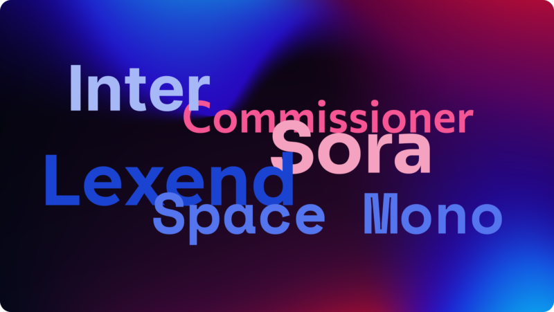
As web design continues to evolve, staying current with typography trends is essential for creating engaging and effective websites. Google Fonts offers a continually updated library of fresh and innovative typefaces that can enhance the aesthetic and functionality of your digital presence. Here’s a look at some of the best new Google Fonts for 2024, ideal for giving your website a modern and professional edge.
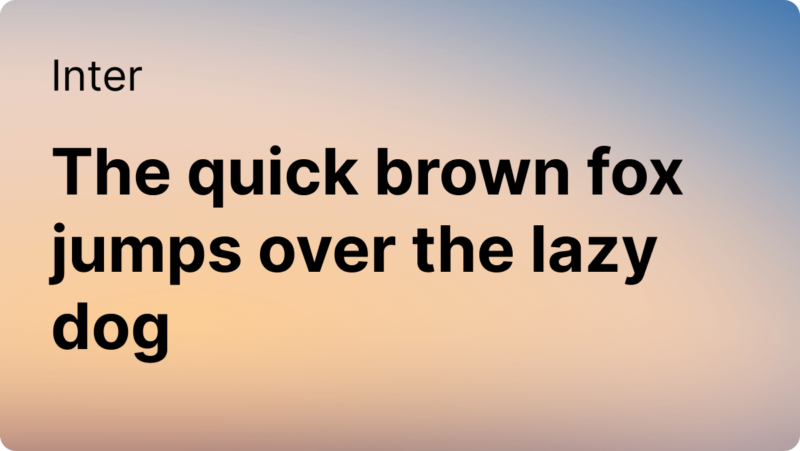
Inter: Built for Digital Spaces
Diving into the world of UX/UI design with the Inter font is akin to discovering a hidden gem that's both a delight to the eyes and a boon for readability. Crafted with precision by Rasmus Andersson, Inter initially presents itself with a deceptively simple appearance. Yet, beneath its surface lies a powerhouse of functionality specifically tailored to thrive in digital landscapes.
Inter's claim to fame is its meticulous optimization for computer screens—where each letterform is drawn and redrawn until it reaches a point of near-perfect balance. The magic of Inter lies in its variable font technology. This isn't just about having a range of weights and styles at your fingertips; it's about fluidity and adaptability in real-time, allowing UX designers to tweak and adjust the font on the fly to match the specific demands of any digital interface.
But Inter is not all work and no play. Its tall x-height and subtle quirks in the letterforms inject a warm, humanist touch that softens the often harsh lines of digital design. It makes text not only easy to read but also inviting—a critical factor when you're trying to keep users engaged and prevent them from bouncing off to less strenuous pastures.
Moreover, the typeface is a cosmopolitan creature, supporting a myriad of languages and scripts, making it an ideal candidate for global applications. Its extensive character set ensures that no matter where your users are in the world, the text remains approachable and legible.
Incorporating Inter into your projects means signing up for a typeface that’s not only robust and flexible but also designed with the future in mind. It’s perfect for those looking to push the boundaries of what’s possible in UX design, ensuring that every interaction feels as good as it looks. As we continue to evolve our digital experiences in 2024, Inter stands ready to help design teams everywhere create intuitive and beautiful user interfaces.
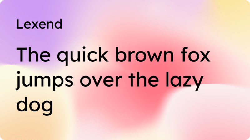
Lexend: Enhanced Readability in User Interfaces
Lexend isn't just another font; it's a revolution in the way we approach reading online. Designed from the ground up with a focus on enhancing reading speed and comprehension, Lexend is tailored for those who cherish every minute and every word. Born from extensive research into the effects of typeface design on readability and comprehension, Lexend stands out as a font that doesn't just fill space—it enhances it.
What really makes Lexend a game-changer in UX/UI design is its foundation in scientific study. The typeface was crafted based on the findings that tweaking letter spacing, font size, and shape can significantly impact reading proficiency. This isn't just about making words legible; it's about making them readable faster and more comfortably, which is critical in our fast-paced digital world where user attention spans are at a premium.
However, Lexend's appeal isn't limited to its functionality. Its design exudes a clean, uncluttered aesthetic that fits seamlessly into modern web and app interfaces, promoting an environment that feels less congested and more inviting. This makes it an excellent choice for applications that require extended reading periods or cater to users with reading difficulties, including dyslexia.
Moreover, Lexend's versatility across different languages ensures that it maintains its readability benefits globally, making it a universal solution for diverse audiences. This widespread applicability makes Lexend not just a font but a vital tool for designers aiming to create more inclusive and accessible digital experiences.
Choosing Lexend for your UX projects means choosing a typeface that cares as much about your users' reading experience as you do. It's a thoughtful addition to any designer's toolkit, perfect for those who are looking to improve the visual impact of their interfaces and enhance the overall user interaction. As we navigate the future of digital design in 2024, Lexend is poised to play a pivotal role in making the digital world a more readable—and understandable—place.
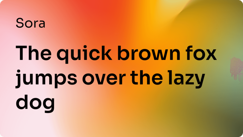
Sora: Futuristic and Sleek
Sora, with its futuristic and aerodynamic flair, is not just a typeface; it’s a vision of typography from tomorrow, perfect for UX/UI designers looking to craft interfaces that are not only functional but also ahead of their time. This geometric sans-serif soars beyond the conventional, providing a crisp, clean aesthetic that captures the essence of modernity and innovation.
What sets Sora apart in the landscape of digital design is its impeccable balance between style and clarity. It’s designed to make a statement without overwhelming the content it accompanies, making it ideal for both headings and user interface elements where readability must align with engaging visuals. This blend of sharpness and clarity ensures that every letter not only stands out but also enhances the overall interface by making navigation intuitively simple.
The true beauty of Sora lies in its adaptability. It thrives across various digital mediums—be it mobile apps, web pages, or digital displays—maintaining its distinctiveness without sacrificing usability. This typeface comes equipped with a range of weights and styles, which empowers designers to use it in a myriad of contexts, from bold headlines to subtle text, all while keeping the user experience smooth and seamless.
Additionally, Sora is built to be a global player. Its extensive character set supports multiple languages, which is a boon for applications with a worldwide audience. This ensures that Sora’s stylish demeanour is accessible and effective across cultural and linguistic barriers, making it a go-to typeface for international projects.
Choosing Sora for your design projects means embracing a typeface that’s crafted not just for today’s needs but for the future’s possibilities. It’s ideal for those who envision their projects to be at the forefront of digital design, where every element of the user interface needs to resonate with innovation and elegance. As we push forward into 2024, Sora is poised to help lead the way in creating more engaging, effective, and visually captivating digital experiences.
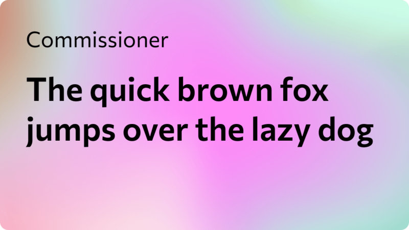
Commissioner: A Humanist Touch to UX Design
Commissioner slides into the world of UX/UI design like a breath of fresh air. This low-contrast, humanist sans-serif font merges the warmth of traditional serif fonts with the clarity and simplicity of modern sans-serifs. Commissioner is all about adding a personal touch without losing the professional edge, making it ideal for digital environments where both character and readability are key.
This typeface captures the best of both worlds. Its quirky details, such as the slightly unconventional shapes of certain letters, bring a unique charm that can make digital spaces feel more inviting and less sterile. It’s a blend that speaks of approachability and authority, perfect for brands that want to appear friendly yet competent. Whether it's used on a comprehensive dashboard or a minimalist app interface, Commissioner maintains its legibility and ensures that users enjoy a frictionless interaction.
Commissioner’s versatility is a standout feature. Available in multiple weights and styles, it can adapt to various design needs—from bold headlines that need to make an impact to body texts that require subtlety. This adaptability makes it a powerhouse in the toolkit of UX designers, who can deploy it across a range of platforms and devices without losing consistency or effectiveness.
What also makes Commissioner a valuable asset in global projects is its extensive language support, ensuring that the text is not only beautiful but also inclusive. This typeface supports a multitude of languages, which is particularly beneficial for applications aiming to reach a diverse audience.
Embracing Commissioner in your design projects means choosing a typeface that brings personality and warmth to the digital landscape. It’s perfect for those seeking to soften the digital experience with a typeface that offers both style and substance. As we move into 2024, Commissioner is perfectly poised to help shape user-friendly, engaging interfaces that stand out in the ever-evolving world of digital design.
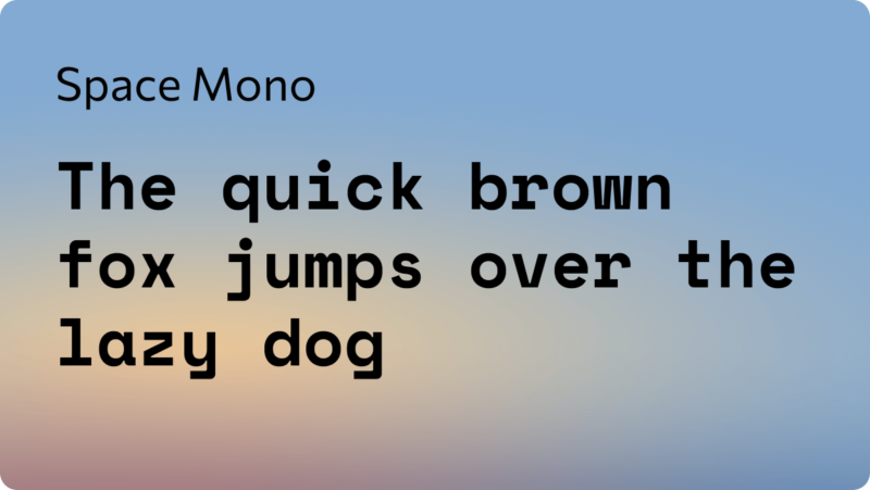
Space Mono: A Unique Typeface for Groundbreaking UX
Space Mono leaps onto the scene of UX/UI design as a standout monospaced typeface that marries the precision of technical design with the flair of contemporary aesthetics. Its arrival brings a refreshing take on the traditional use of monospaced fonts in digital environments, making it a fascinating choice for projects that require a blend of function and style.
This typeface, with its fixed-width character design, originally tailored for coding and data processing environments, excels in creating a structured and easily navigable interface. Space Mono's uniformity ensures that text elements align perfectly, which is essential for readability in complex applications like coding platforms or detailed data visualizations.However, it's not just about utility; the typeface's clean lines and modern touch inject personality into spaces that might otherwise feel stark or impersonal.
Space Mono also offers a distinctive aesthetic that can transform mundane interfaces into engaging experiences. Its character comes from a careful balance of retro and futuristic styles, making it particularly appealing for projects that aim to stand out visually. This can be especially effective in creative industries, like gaming or digital art platforms, where a unique typographic touch can significantly enhance the user's engagement.
Despite its structured appearance, Space Mono is surprisingly versatile. It can be used across various digital media—from websites and mobile apps to digital displays and user interfaces. This versatility ensures that designers can maintain a cohesive look and feel across different platforms, reinforcing brand identity and improving user experience.
Furthermore, Space Mono’s support for multiple languages extends its utility across global applications, ensuring that its benefits are not limited to English-speaking audiences. This inclusivity is crucial for products that cater to a diverse user base, enhancing the accessibility and usability of the interface.
Choosing Space Mono for your UX/UI design projects means embracing a typeface that is both methodical and charismatic. It's an ideal choice for those looking to enhance the functionality and aesthetic appeal of their digital projects, ensuring that every element on the screen is both visually captivating and perfectly aligned. As 2024 approaches, Space Mono is poised to be a key player in designing more intuitive and distinctive digital environments.
Concluding Thoughts: Elevating UX Design with Innovative Typography in 2024
As we look forward to 2024, the role of typography in UX/UI design is more pivotal than ever. The fonts we discussed—Inter, Lexend, Sora, Commissioner, and Space Mono—each offer unique features that can significantly enhance the user experience across digital platforms. From enhancing readability with Lexend to adding a distinctive flair with Space Mono, these typefaces provide UX designers with powerful tools to improve clarity, aesthetics, and overall usability.
Typography in UX design is not just about choosing visually appealing fonts; it's about making strategic choices that align with the goals of your digital project. Whether it's creating a comfortable reading environment, ensuring consistency in UI elements, or adding a touch of personality to a brand, the right typeface can make a substantial difference.
For designers, the key is to consider the context in which these fonts will be used and to understand the audience that will interact with them. Integrating these typefaces into your design process should be thoughtful and informed, aiming to create interfaces that are not only beautiful but also functional and inclusive.
As we continue to navigate the complexities of digital design, the thoughtful selection of typefaces like those highlighted here will be crucial in crafting experiences that are both engaging and effective. Embrace these typographic tools to ensure your projects are not only trend-forward but also poised for success in enhancing user interaction and satisfaction in 2024 and beyond.