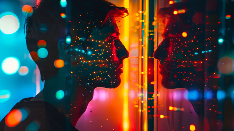
Embracing the Future: New UI Design Trends for SaaS Products
In the ever-evolving landscape of software as a service (SaaS), staying ahead of design trends isn't just about aesthetics—it’s about providing users with an intuitive, efficient, and engaging experience. Let's dive into the latest trends shaping the UI design of SaaS products, ensuring your tool looks fresh and aligns perfectly with user expectations and needs.
Neumorphism: A Delightful Middle Ground
Neumorphism, a cutting-edge UI design style, is leaving its mark on the digital landscape. Its distinctive features include soft, inset shadows harmoniously blended with subtle emboss effects, creating an illusion of physicality that transcends the boundaries of digital interfaces. Picture buttons that exude a tactility so inviting you almost feel compelled to reach out and touch them. Sliders that feel genuinely graspable, as if you could seamlessly interact with them.
This design trend elevates user experience by mimicking real-world objects and enhancing the tactile perception of applications. With neumorphism, everyday interactions transform into lifelike experiences. It's not just a visual aesthetic; it's a mindful approach that breathes depth and dimension into digital interfaces.
Neumorphism draws inspiration from skeuomorphic design, a style that sought to replicate physical objects in digital form. However, neumorphism takes a more nuanced approach, eschewing unnecessary details and focusing on essential elements. The result is a design style that feels familiar and modern, creating a seamless transition between the physical and digital worlds.
One of the key strengths of neumorphism is its versatility. It can be effortlessly integrated into various design contexts, ranging from mobile apps to website interfaces. It's particularly effective in user interfaces where tactile feedback is crucial, such as music players, camera apps, and e-commerce platforms.
The emergence of neumorphism marks an exciting chapter in UI design history. It's a style that embraces the convergence of aesthetics and functionality, creating interfaces that are not only visually appealing but also intuitively interactive. As technology continues to evolve, neumorphism has the potential to shape the future direction of user experience, blurring the lines between the tangible and the intangible.
Neumorphism has accessibility advantages and disadvantages. While its high contrast and 3D appearance benefit individuals with low vision or cognitive disabilities, the same elements may hinder colour-blind individuals or confuse those with disabilities. Accessible Neumorphic design guidelines emphasize using high-contrast colours, avoiding shadows, maintaining simplicity, and testing designs with individuals with disabilities.
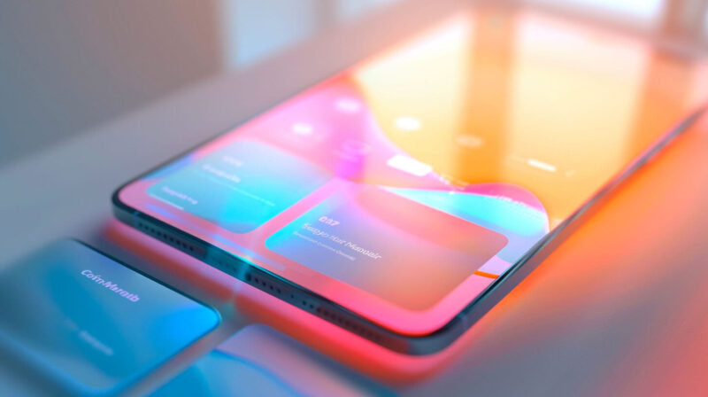
Dark Mode: Easing into the Darkness

Dark mode has transformed from a fashionable trend to a crucial element, mainly in SaaS applications. It offers significant advantages beyond aesthetics. Here's an exploration of the benefits of dark mode and why it's essential for SaaS products:
- Reduced Eye Strain: In low-light environments, staring at bright screens can cause eye strain, leading to discomfort and diminished focus. Dark mode provides a gentler visual experience, reducing eye strain and enabling users to work comfortably for extended periods.
- Improved User Engagement: Studies have shown that dark mode can positively impact user engagement. By reducing eye strain, users can spend more time interacting with the SaaS application, leading to increased productivity and satisfaction.
- Better Sleep: Exposure to blue light, prevalent in traditional light mode screens, can disrupt the body's natural sleep cycle. Dark mode reduces blue light emission, allowing users to transition to sleep more easily after using the application.
- Sleek Aesthetics: Dark mode adds a sleek and sophisticated touch to SaaS products, making them visually appealing and trendy. This design choice aligns with modern aesthetics and enhances the overall user experience.
- Accessibility Consideration: Dark mode accommodates users with visual impairments or light sensitivities. Offering a high-contrast interface improves accessibility and inclusivity, ensuring a comfortable experience for everyone.
- Battery Conservation: Dark mode can contribute to battery conservation in some devices. Reducing the brightness of the screen lowers power consumption and extends battery life.
- Enhanced Design Elements: Dark mode provides a backdrop for other design elements to stand out. Vivid colours and contrasting elements become more prominent, creating a visually engaging and immersive user interface.
In conclusion, offering a dark mode in SaaS applications is not merely a visual enhancement; it encompasses user comfort, accessibility, and engagement. By embracing dark mode, SaaS providers can create visually appealing products conducive to extended, productive use.
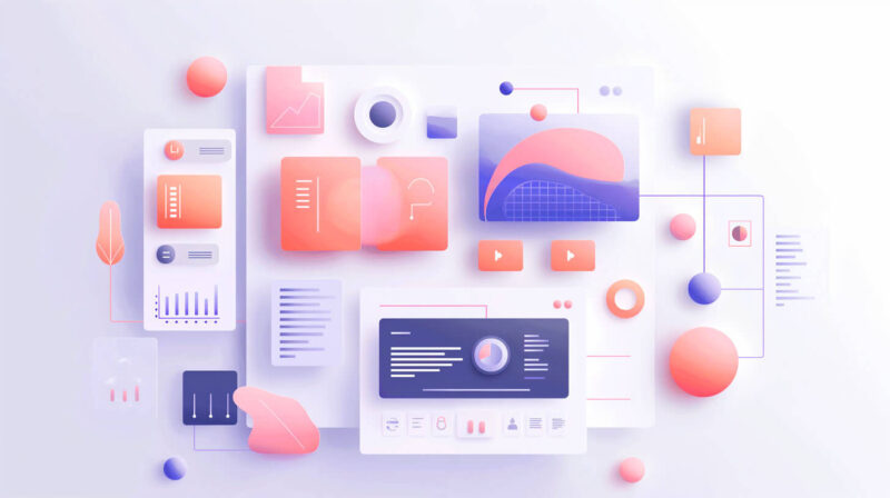
Glassmorphism: The Clear Winner
Glassmorphism is a design trend that creates a sense of depth and hierarchy through transparency and multi-layered approaches. It relies heavily on background blurring effects to make elements and data seem as though they are floating on the interface. This style is particularly effective in dashboard UIs, where large amounts of data and analytics need to be distinctly separated yet visually cohesive.
Here are some key characteristics of glassmorphism:
- Transparency: Glassmorphism uses transparency to create a sense of depth and layering. This can be achieved through the use of transparent backgrounds, semi-transparent elements, and frosted glass effects.
- Multi-layered approaches: Glassmorphism often employs multi-layered approaches to create a sense of hierarchy. This can be done by stacking elements on top of each other, using drop shadows to create depth, and varying the opacity of elements.
- Background blurring effects: Background blurring effects are essential to glassmorphism. They help create a sense of separation between elements and the background, making elements appear to float on the interface.
- Soft colours: Glassmorphism often uses soft, pastel colours to create a calming and soothing effect. These colours are also effective at creating a sense of depth and layering.
- Minimalism: Glassmorphism is often associated with minimalism. This is because the simplicity of glassmorphism helps to create a clean and uncluttered look.
Here are some examples of how glassmorphism can be used in dashboard UIs:
- A dashboard that displays key performance indicators (KPIs) can use glassmorphism to create a sense of hierarchy. The most critical KPIs can be placed in the foreground, while less essential KPIs can be placed in the background.
- A dashboard that tracks sales data can use glassmorphism to create a sense of depth. The sales data can be displayed in a stacked bar chart, each representing a different product. The bars can be blurred to create a sense of depth and to make the data easier to read.
- A dashboard that displays social media analytics can use glassmorphism to create a sense of visual cohesion. The different social media platforms can be represented by different coloured circles. The circles can be blurred to create a sense of unity and to make the data easier to compare.
Vivid Colors and Bold Typography: Stand Out from the Crowd
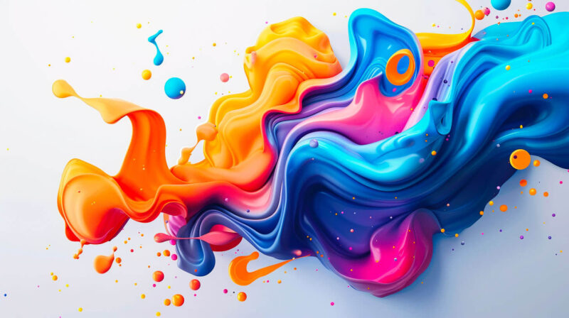
The design paradigm in the digital realm has undergone a radical shift, leaving behind the era of conservative muted palettes and conventional fonts. The contemporary design landscape is characterized by a vibrant embrace of vivid, saturated colours that captivate the user's attention. Bold typography takes centre stage, accentuating critical actions and messages with a striking visual impact. This transformative approach not only revitalizes the user interface but also plays a pivotal role in segmenting information effectively. In the context of SaaS platforms, where data overload can pose significant challenges, this segmentation becomes crucial. By employing a combination of eye-catching colours and commanding typography, designers can create a visual hierarchy that guides users effortlessly through complex information landscapes, enhancing usability and fostering a seamless user experience. This strategic approach not only ensures that essential actions are noticed but also helps users quickly grasp key concepts and make informed decisions.
Advanced Micro-interactions: Small Touches, Big Impact

Micro-interactions have been a part of the digital landscape for quite some time, but their significance and sophistication have grown exponentially in recent years. These tiny animations and effects, which occur when users interact with specific elements, have become an integral part of the user experience.
Consider the simple act of clicking a button. In the past, a button would simply change colour or display a loading icon to indicate that it had been clicked. Today, micro-interactions have elevated this interaction by adding subtle animations, such as a ripple effect that emanates from the button or a brief zoom effect that draws the user's attention to the change. These micro-interactions not only provide visual feedback and reinforce the user's action but also add a touch of delight and engagement.
Another example of a micro-interaction is the progress bar that appears when data is being uploaded or downloaded. Traditionally, a progress bar would simply display a static bar that gradually fills up as the data is transferred. Contemporary micro-interactions have transformed this mundane process into a visual spectacle, with animated elements and smooth transitions that keep the user informed and entertained throughout the process.
The impact of micro-interactions on the overall user experience is undeniable. They serve multiple purposes:
- Feedback: Micro-interactions provide immediate and intuitive feedback to the user, confirming that their action has been registered and is being processed. This feedback loop enhances the sense of control and reduces uncertainty.
- Delight: Well-designed micro-interactions can evoke positive emotions and create a sense of delight in users. Delightful micro-interactions can leave a lasting impression and enhance the user's overall experience of the product or service.
- Engagement: Micro-interactions can increase user engagement by keeping them visually stimulated and mentally engaged. Subtle animations and effects can draw the user's attention and encourage them to explore the interface further.
- Trust: Micro-interactions can build trust by demonstrating that the interface is well-thought-out and polished. They convey attention to detail and communicate a sense of professionalism.
By incorporating micro-interactions into their designs, UX professionals can create interfaces that are not only functional but also engaging, delightful, and memorable. These tiny details can make a significant difference in the overall user experience, leaving users with a positive impression of the product or service.
Voice User Interfaces (VUI): The Silent Revolution
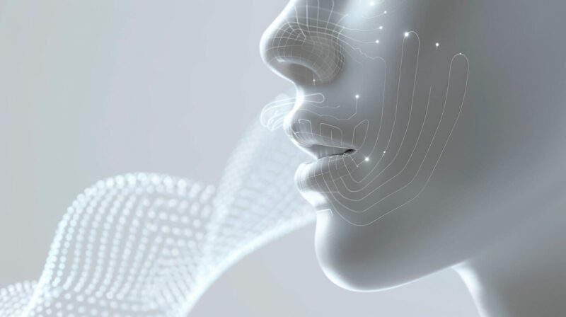
As voice technology continues to evolve and mature, integrating voice user interfaces (VUIs) into SaaS products presents a remarkable opportunity for businesses to revolutionize their user experience. This is particularly advantageous in tools where multitasking is common or hands-free control is essential. Here's how VUI can transform your SaaS offering:
- Enhanced Accessibility: VUI makes your application more accessible, catering to a wider range of users. Individuals with visual impairments, physical disabilities, or in situations where reading a screen is impractical can seamlessly interact with your product using voice commands. This promotes inclusivity and empowers users with diverse needs.
- Improved User Efficiency: VUI streamlines user workflows, allowing users to multitask effectively. By removing the need for constant screen interaction, users can perform tasks while simultaneously handling other activities. This enhances productivity, especially in fast-paced and demanding work environments.
- Seamless UI Integration: VUI enables a seamless transition between different UI elements using only voice commands. This eliminates the need for users to navigate through menus or click buttons, creating a more intuitive and engaging user experience.
- Personalized Interactions: VUI can offer personalized interactions tailored to individual users. By leveraging machine learning and natural language processing, your application can learn from user preferences and provide relevant suggestions or recommendations, enhancing the overall experience.
- Enhanced Customer Support: VUI can serve as a valuable tool for customer support. Users can quickly and easily access help or troubleshoot issues using voice commands without the need for extensive text-based instructions or lengthy phone calls. This enhances customer satisfaction and reduces support costs.
- Competitive Advantage: In a crowded SaaS market, integrating VUI sets your product apart and provides a unique value proposition. By offering hands-free control and a natural, intuitive user interface, you can attract tech-savvy users and stay ahead of the competition.
- Future-Proofing Your Product: VUI adoption is on the rise, and integrating it into your SaaS product ensures that you are well-positioned for the future. As voice technology continues to advance, your application will remain relevant and competitive, meeting users' evolving needs.
By incorporating VUI into your SaaS product, you can unlock a host of benefits that enhance user experience, boost productivity, and drive business growth. Embrace the power of voice technology and create a truly transformative SaaS solution.
Personalization: Beyond Just a Name
Personalization in UI design is a crucial aspect of creating engaging and user-friendly SaaS products. It goes beyond simply addressing the user by name; it involves dynamically adjusting user interfaces based on a variety of factors, such as user roles, preferences, and behaviours. By doing so, personalization ensures that each user experiences a tailored and seamless interaction with the product, enhancing their overall satisfaction and productivity.
Here's how personalization in UI design benefits SaaS products:
- Increased User Engagement: Personalized user interfaces capture the user's attention and make them feel valued. When users see content and features that are relevant to their specific needs and preferences, they are more likely to engage with the product and explore its offerings.
- Improved User Experience: Personalization enhances the overall user experience by making it intuitive and efficient. Users don't have to navigate through irrelevant information or features, which reduces cognitive load and improves task completion times.
- Increased Productivity: By providing users with tailored interfaces, personalization helps them accomplish their tasks more quickly and efficiently. This can lead to increased productivity and better business outcomes.
- Reduced Support Costs: Personalized user interfaces can reduce the need for customer support by providing users with the information and features they need upfront. This can save time and resources for both the support team and the users.
- Higher Customer Satisfaction: When users feel that the product understands their needs and provides a tailored experience, they are more likely to be satisfied and become loyal customers. This can lead to increased customer retention and positive word-of-mouth.
Here are some examples of how personalization can be implemented in SaaS products:
- Customizable Dashboards: Users can customize their dashboards to display the metrics and information that are most relevant to them. This helps them quickly access the data they need to make informed decisions.
- Adaptive Menus: Menus can adapt to the user's role and permissions, displaying only the options that are relevant to them. This simplifies navigation and reduces clutter.
- Contextual Help and Tutorials: Help documentation and tutorials can be tailored to the user's task and context, providing targeted assistance when needed.
- Personalized Recommendations: The product can recommend features, content, or services that are relevant to the user's interests and preferences. This can help users discover new features and get the most out of the product.
- Dynamic Content: The content displayed on the user interface can be dynamically adjusted based on the user's location, language, or previous interactions with the product. This ensures that users always see the most relevant information.
By implementing personalization in UI design, SaaS companies can create products that are tailored to the individual needs of their users, resulting in increased engagement, improved user experience, increased productivity, and higher customer satisfaction.
Wrapping Up
In today's fast-paced digital world, it's crucial for SaaS products to stand out from the competition and provide an unforgettable user experience. That's where cutting-edge UI design trends come into play. These trends offer exciting opportunities to elevate your SaaS product beyond being just a tool and transform it into a delightful and engaging experience. By embracing these trends, you can create a product that not only meets your users' functional needs but also resonates with them on an emotional level.
These UI design trends are not merely aesthetic enhancements; they are strategic choices that can have a significant impact on user engagement, conversion rates, and overall brand perception. By incorporating elements such as minimalist design, bold typography, vibrant colour palettes, and intuitive user interfaces, you can create a product that is visually appealing, easy to navigate, and enjoyable to use.
Adopting these trends can also help you stay ahead of the curve in a crowded market. When users see that your product has a modern and sophisticated design, they are more likely to perceive it as being innovative and trustworthy. This can set your product apart from competitors who are still relying on outdated or bland designs.
Embracing these UI design trends is not just about following the latest fads; it's about investing in the future of your SaaS product. By staying up-to-date with the latest advancements in UI design, you can create a product that is not only functional but also futuristic and fun to use. This can lead to increased user satisfaction, loyalty, and, ultimately, business growth.
So, get ready to revamp your SaaS UI and let these trends inspire your next design update. Watch as your users fall in love not just with what your product can do, but how it feels to use it.