The Deal with Typography
Typography matters, especially in the world of web design. The way words look has a profound effect on how your users experience the content you are putting out, which is why fonts and styles shouldn’t be left as an afterthought. As a designer, it is important to remember that typography will have an impact on the way users interpret and perceive websites and apps, so below are some tips and concepts to keep in mind when approaching typography as a UX/UI designer. There's a difference between fonts and typefaces
Fonts are defined as a grouping of typefaces that hold similar traits
Typeface refers to the individual family members of a font (think of it as a parent of the different styles of a font)
When choosing a font or typography style for your next design project, keep some of the following tips in mind:
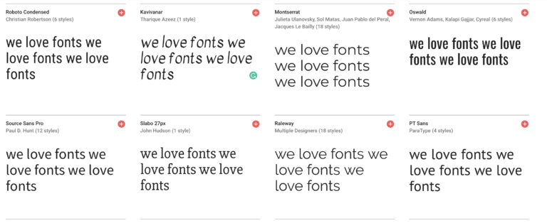
More is less when it comes to fonts
Using one font for everything is boring and doesn’t allow certain sections of texts to stand out. Using too many fonts creates distractions and a rocky transition from one to the other. Balance is key when it comes to figuring out how many different fonts you want to include, the magic numbers are between two and four different fonts.

Standardization is your friend
There are endless styles of fonts, but unless you have a specific reason or need to use a quirky font, it is better to stick with fonts that are clean, simple, and readable. There is a huge selection of different easy-to-read fonts, just check outfonts.google.com
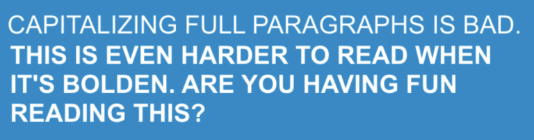
All caps is not your friend
Capitalizing all the words of your text is a terrible idea if you want to make this text readable. It makes the process of scanning slower, it makes the text more aggressive, and it makes you less likable. You want people to read your text, so do them a favor and stick with lowercase. The exception to this rule are acronyms, company names, or logos.
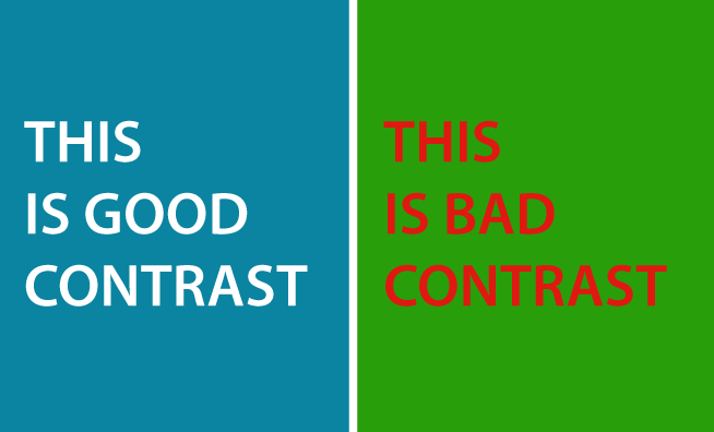
Pay attention to the contrast
Make sure you are creating high contrast between the text and the background. This is a basic rule but it is worth reiterating because there is just nothing worse than illegible text due to lack of contrast.
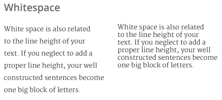
Remember the importance of white space
White space refers to the empty space around a block of text, and it really makes all the difference. Do not cramp your text into a space too small for it, let it breathe. Not only is it more readable, but it looks both sharper and cleaner, isn’t that what you want?
Paying attention to these small differences can completely transform how your users interact with your content, so taking the time to improve in these areas will be nothing short of beneficial for your company long term.