3 Ways to Improve UX by Content Alone
When you think of User Experience Design, the word “design” might create the notion that UX is 100% design related. While it is certainly a major factor, there are other elements such as copy and content which can easily make or break the experience of your users. Putting all of your attention into design elements can ensure you have a beautiful app or website. Failing to consider copy and content could ruin it all.
Here are 3 easy ways to improve your user experience by copy and content alone:
1. Short and sweet copy is an awesome UX
Whether it’s writing for search engine optimization, or if it’s wanting to boast yourself a little too much, there are too many sites these days that are loaded with a copy. In reality, there’s no real need for so much copy. Your users are intelligent, and they also have a seriously short attention span. If they can’t scan your site in under 5 seconds, there’s a good chance you’re going to lose them.
Here are two great examples from the HR Consulting Industry. Can you notice the difference smart copy makes? (You'll want to click the image to enlarge)


The chances that the majority of your users are going to read all of your copy, word for word, is extremely slim. By developing your copy to allow for scannability and by highlighting key areas the viewer should focus on, you have a much better chance to convert a lead, or simply have your user stick around a bit longer.
2. Microcopy
Microcopy is the text you’re using on buttons, forms, labels, etc. It’s the “click here” and “sign up” buttons you might be using on your website, or the UI elements you’re utilizing for your app. Regardless of how you’re using them, they are the difference between having a vague call-to-action and a compelling one that guides your users well.
One simple example is the all too familiar use of the “submit” button. Submit a form. Submit your email address. Whatever you’re doing, “submit” is bland and lacks any interest. Add some flair instead “Join Now”, “Start Banking”, etc. are much better ways to go.
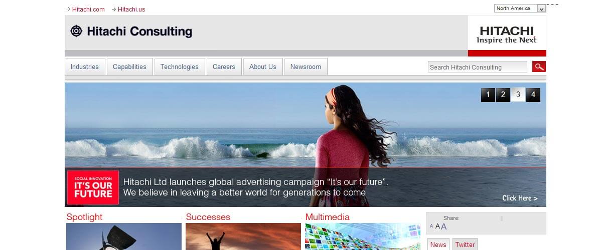
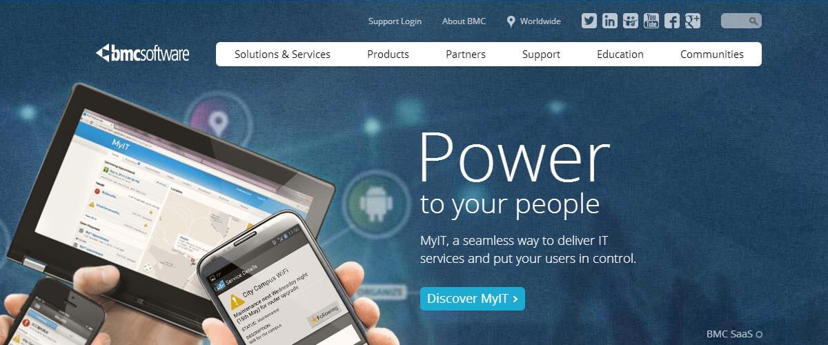
Checking out two examples from the IT Consulting Industry, we can see a huge difference (click to enlarge):
Hitachi Consulting is using the “Click Here” button which provides close to nothing. It’s not enjoyable. It’s not persuasive. There aren’t any nouns.
BMC does an excellent job on the other hand. “Discover MyIT”, “Let’s Get Started”, “Master the Cloud”.
3. Continued Ease
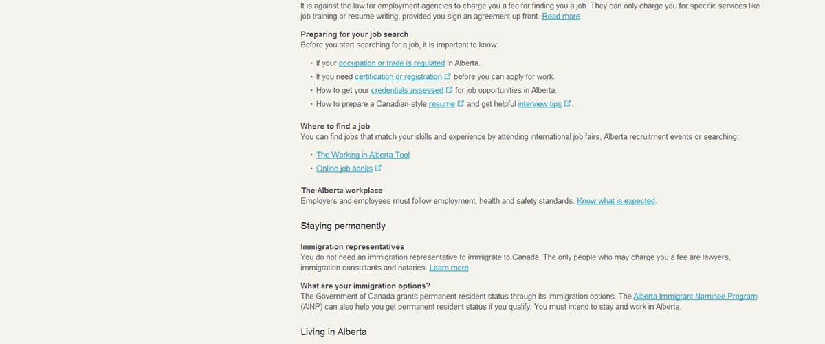
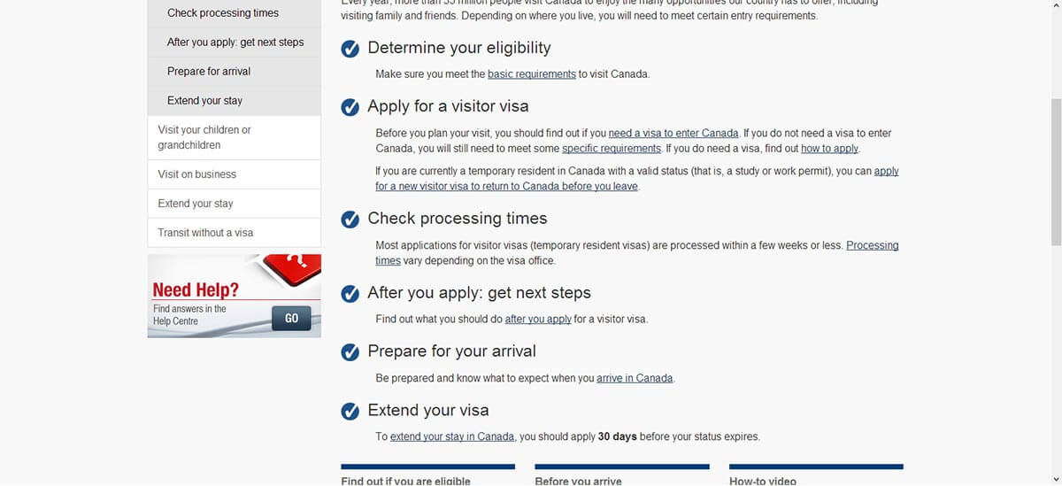
With the above examples, maybe you’re a BMC or BW Bacon. Your messaging is clear and concise. Your microcopy is fantastic. Your users are clicking-through and getting to where you want them to go. You can easily ruin everything you worked on and disappoint your users with a sloppy user experience on the very next page. Let’s take a look at two examples surrounding Canadian Immigration.

The copy starts off short and sweet. It’s concise and gets the user to move on their way instead of reading paragraphs of copy. Good! We also have a defined call-to-action with their “learn more” button, though it could be improved.
The next page is as close to a collage as you can get. Regardless of what you want to do, you’re forced to read through over 600 words (200 less than this article) in order to determine where you want to go. Scannability is gone. Call-to-actions disappear. They got the user to stage two, and then left them to fend for themselves.
Canada Immigration has done a better job. While there aren’t any major call-to-actions, we are guided to first determine what info we’re interested in. Perhaps we want to visit Canada as a tourist. Once we get to the page we want, the content is laid out well. Short and sweet. Overall, a much better experience.
Keep your experience strong
This article has discussed websites primarily. All of the information rings true if you’re working on an app, or an intranet project. It’s important to remember that UX isn’t 100% about design. It’s about providing a rewarding experience for your user. By keeping your copy short and to the point, directing your user down a path and compelling them to go down it, and ensuring there aren’t any hiccups in their experience, you can ensure a positive experience.
There are plenty of other sites and apps out there. The more vague and laborious you make your experience, the more you’re compelling your users to head elsewhere. Keep them with you by keeping this info in mind. Your users will thank you for it!