2020 Web Design Trends
The last time we looked at the top UX web design trends was back in 2018, and in these past two years we have seen many UX trends come and go, thus a 2020 update was long overdue. We scanned the most prominent trends to get an understanding of what we can expect to see in UX design this year, and what this means for the UX industry as a whole.
Asymmetrical Layouts for Websites
2020 has given rise to asymmetrical grids and layouts, with more and more designers choosing to go against the traditional grid system that has characterized web design for years. Whereas symmetrical layouts have provided platforms and products with balance, harmony, and simplicity, asymmetrical layouts are dynamic and can be used to convey movement or draw the eyes to certain areas. Further, they can give an interesting, lively, and active atmosphere to the platform or product layout, whereas overuse of symmetry can leave a feeling of flatness and coldness, and can leave users disengaged.
Asymmetric design can also be used to achieve informal balance, where objects on either side of the vertical or horizontal axis may not be precisely symmetrical, but the content is organized in a way that an even amount of space is being taken up on both sides.
Spacious Layouts
Empty space is an important and often overlooked active design element that can be used to create a visual hierarchy within a web design. Empty or negative space can be divided into two categories:
Macro spaces: this refers to larger segments of negative space, such as that between the logo, the header, the footers, and the margins.
Micro spaces: this refers to smaller segments of negative space, such as the spacing between text bodies and lines.
Generally, negative space is the empty space that surrounds elements (such as text, images, or graphics) on a web page. The Gestalt theory tells us that the whole is bigger than the sum of its parts, and we can use this theory to understand the importance of negative space in the greater scheme of user experience and perception. There has been a longstanding myth in UX that negative space will make it harder for users to process information and content quickly, however, this couldn’t be farther from the truth as negative space actually forces users to focus on the most relevant content first, instead of grouping it in with the surrounding elements (a data processing method also known as “chunking”). Scientific research backs up this claim, as a study conducted by Wichita State University found that negative space can actually improve reading comprehension by up to 20%, when used correctly.
Inclusive Design
Accessibility is quickly becoming a priority among both web and mobile users and designers. Whereas in the past companies have hired outside consultants to modify and point out the accessibility holes in their platforms and products, today, designers are factoring in accessibility from the get-go. Inclusive design is set to become the main focus for UX designers this year, especially those located in the United States. The Web Content Accessibility Guidelines (WCAG) was passed by the United States Supreme Court in 2019, meaning that designers and developers in the United States now have a legal responsibility to ensure that their websites and webpages accommodate disabilities.
The goal of inclusive design is to seek out points of exclusion and come up with creative solutions in order to ensure that the designs put forth are accommodating all users, regardless of their disabilities. By starting at the margins and slowly working your way to the center, designers are able to increase the usefulness of their overall design as a greater number of needs can be addressed through this process. Inclusive design involves creating a variety of ways for users to engage with a website to allow users to choose which method best suits their needs. An auditory experience (such as a video) can be made accessible for users with hearing disabilities by providing them with the option of closed captions or a transcript.
Monochromatic colors
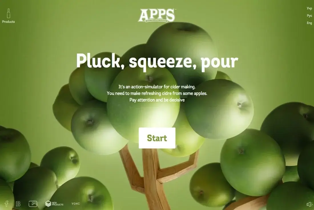
The monochromatic palette, which refers to the combination of varying tones and hues of a single color, is quickly gaining popularity within the UX/UI industry. A monochromatic design provides a sense of cohesion, balance, and unity in the website or product.
Limiting color palettes across a website enables designers to ensure a feeling of continuity for users, and the reinforcement of a predetermined theme. Whereas in the past UX design favored simple black, white, and grey color schemes, we expect to see the incorporation of more vibrant and unique colors such as blues and greens. The use of color will increase the contrast between elements on a website while continuing to maintain the harmonious and balanced feel of a well-designed website.

Sustainable Design
We’ve written about sustainable design before back in the summer of 2019, however, since then sustainable UX has gained attention and momentum, as users are becoming more aware of climate change and the impact of technology on the environment. This awareness has translated into increased public pressure on industries and companies to contribute to sustainable practices, and this includes web design. Sustainable design can be understood as related to minimalist design since part of sustainable design is avoiding bloated websites. By reducing the amount of data a webpage requires will not only help the environment by reducing the amount of energy required to keep that website running, but it will help reduce slow loading speeds that hinder the experience of users who are visiting your page. Win-Win for everyone.