Windows Mobile 6.5 UI issues and Windows Mobile 7
ZDNet reports that Windows Mobile 7 is on track for release to OEMs for testing. It is interesting to see what MS can come up with in the new highly competitive market. Android, Sumsung's just announced Bada, iPhone OS, Symbian^2 - the first open version of Symbian's OS.
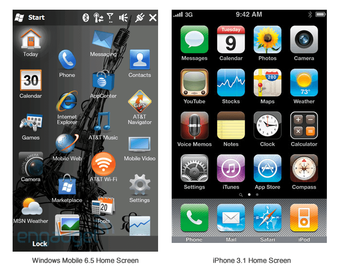
Windows 6.5 was not up-to-speed with the competition. The UI is complex and hard to use. But, intuitiveness has never been a strong point of MS products. Here is a small analysis of the Windows 6.5 home screen from usability prospective.

The iPhone 3.1 home screen is an ample or much better and usable approach. And here's why the Windows 6.5 screen isn't as intuitive.
- Uneven grid in additional to uniquely shaped icons makes it look untidy and harder to scan.
- Inconsistent icons style.
- Background under the icons makes it harder to scan the screen.
- Icons are allowed to have unique shape, which theoretically helps to find an icon but the current implementation presents 2 problems:
- Icons are not consistent for some have unique share and some just use rounded corner "iPhone" frame.
- Without knowing what the background color might be there is a high probability of poor visibility of the icon for lack of contrast. (Camera icon and AT&T Music illustrate the problem).
It may be hard for Windows Mobile to recapture the market unless they make it really usable and appealing to end-users.