Android Market and Apple’s App Store
As Android Market has grown to about the 20,000 apps mark, it is interesting to compare two different approaches to user experience. While Apple sets up very strict approval rules in an effort to assure only well-done and polished apps get through to an end-user, Google doesn’t set any approval process at all. Aesthetics have never been Google’s concern although its nothing-gets-in-the-users-way approach has become a signature style on its own. And it does work very well on the web, but for mobile apps, it may not.
In many cases, visual aspects of apps and UI become the very corners that are being cut in order to minimize product-to-market time and expenses. As a result, we see less-than-inspiring graphics, confusing user interfaces, and an overall lack of consistency. One of the iPhone's strong points is the well-designed default UI elements that help to assure some level of consistency across various applications. After all, apps are just tools running on a mobile device, and shared layout principles help a great deal in minimizing the learning curve for users.
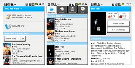
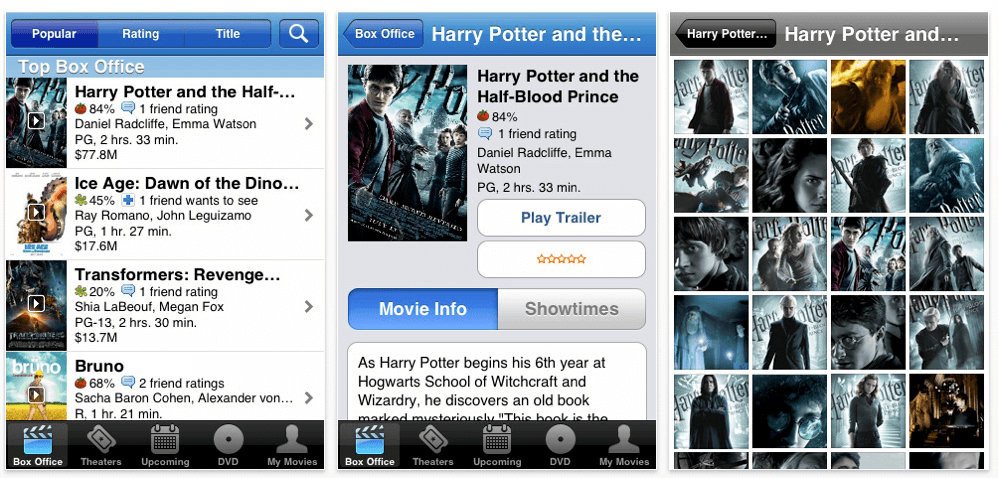
Below is a screenshot of the Apple Store’s Movies App that uses default iPhone library elements as well as a very similar app from the Android Market.

