UX
Enterprise UX Trends for Late 2025: Smarter, Simpler, More Human-Centered Design
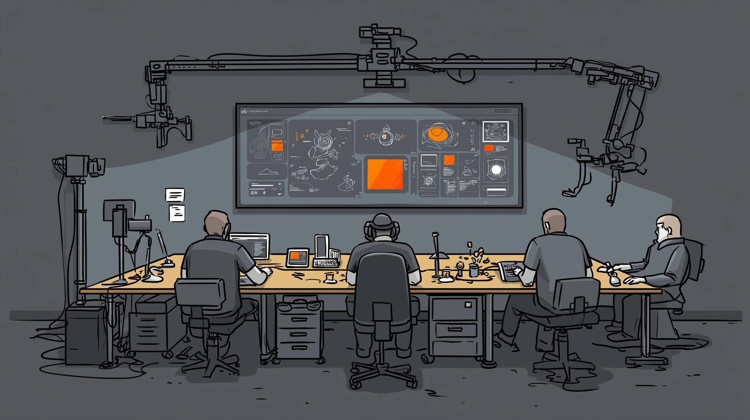
As we enter the latter half of 2025, enterprise UX is evolving to reflect technological advancements as well as cultural, operational, and ethical changes. If 2024 was about laying the groundwork for more adaptive, inclusive, and intelligent experiences, the back half of 2025 is proving to be a time of refinement and realignment. Here are…
B2B UX in the Age of AI and Automation: Personalized User Journeys
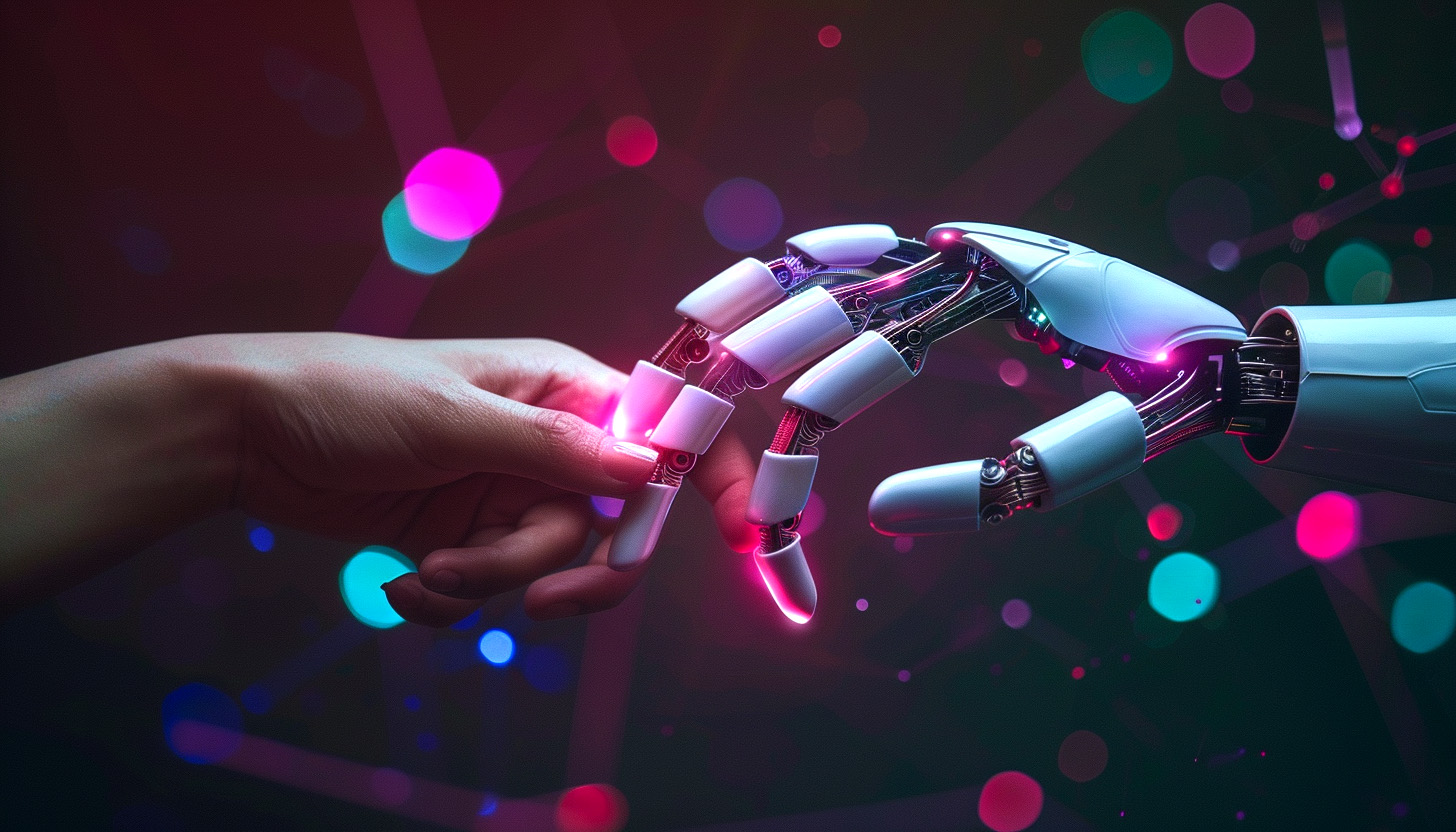
The advent of AI and automation marks a pivotal shift in the B2B landscape, ushering in a new era of digital transformation that touches every facet of business operations, from sales and marketing to customer service and beyond. This transformative wave brings with it a bounty of opportunities for innovation and growth but also necessitates…

Emerging UX Trends in 2024: Navigating the Future of B2B Digital Experience
As we advance into 2024, the realm of Business-to-Business (B2B) User Experience (UX) design is undergoing a remarkable transformation. In an era where digital interactions are increasingly pivotal, B2B platforms are not just focusing on functionality and aesthetics; they are redefining how they engage with users. The latest trends in B2B UX design reflect a…

Calculating the ROI of your UX activities
When measured correctly, revenue from UX projects can be directly correlated with your investment. This is why it is increasingly important to understand how to measure your ROI in relation to your UX projects. User experience activities can reduce developmental inefficiencies in a number of ways, such as diminishing wasted development time, shortening development time…
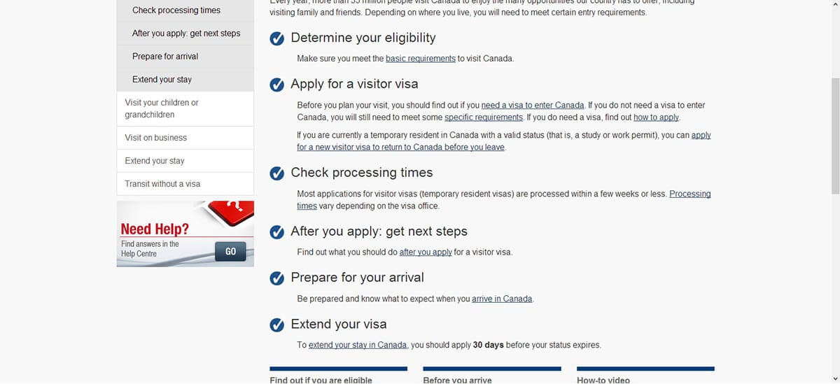
Top 8 Signs Your Site Is Outdated
Overview Having an updated site is a huge part of giving users the ultimate user experience. For instance, your site users can’t enjoy using your site if the pages load slowly because of outdated features in your site. Also, unresponsive sites are downright outdated since they aren’t up-to-date with the mobile devices most people are…
6 Effective User Design Tips for Inciting User Emotion
Overview: User design for inciting emotion For more than a decade, web designers have focused solely on logical design factors i.e. meeting web standards, choosing layouts & fonts, organizing navigation, etc. Design, however, is evolving at a very fast pace. The focus has shifted to inciting user emotion. Web designers are focusing more on creating…
Why Marketers Should Care About UX
Overview User experience refers to any interaction potential or existing customers have with a brand. Although user experience is a relatively new concept to many people today, the concept has proven to be very important in online business. In the recent past, user experience was confined to web design. Today, the concept spans to on-page…
Increase User Retention With A Better User Experience
Introduction Convincing users to download your app isn’t as difficult as convincing them to use the app for a prolonged time period. According to recent studies, only 10-20% of users use apps on their devices a few months after downloading them. This simply means that user experience is more important in getting users to use…
3 Ways to Improve UX by Content Alone
When you think of User Experience Design, the word “design” might create the notion that UX is 100% design related. While it is certainly a major factor, there are other elements such as copy and content which can easily make or break the experience of your users. Putting all of your attention into design elements…
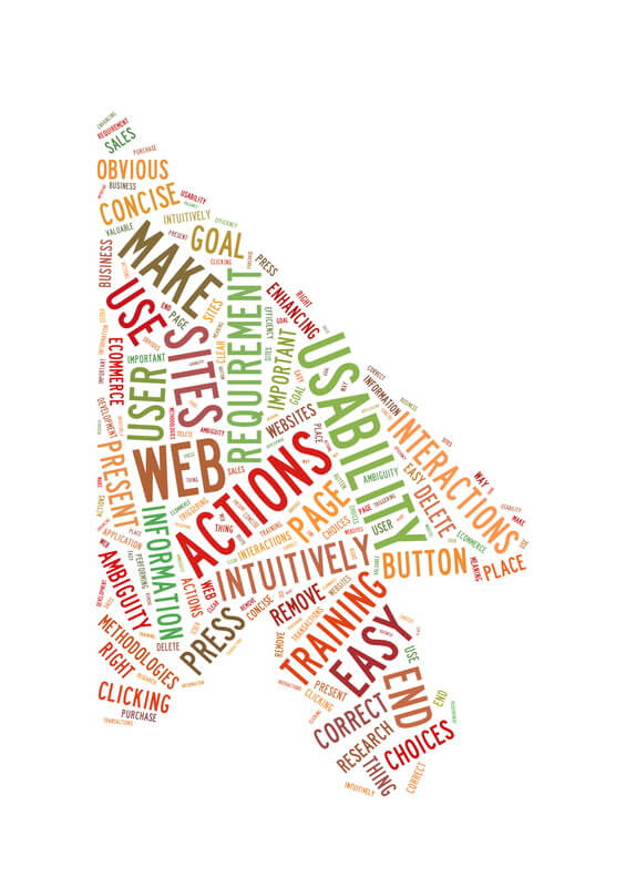
The Top 5 Usability Myths
When it comes to technology, there are various guidelines that are essential for good user experience. This includes accessibility, user interface, information architectures and usability. UX design is the ultimate human vs. computer interaction where certain methods and techniques are employed to produce a desired, predictable and well-executed result. Accessibility, user interface, information architectures and…