Blog
Enterprise UX Trends for Late 2025: Smarter, Simpler, More Human-Centered Design
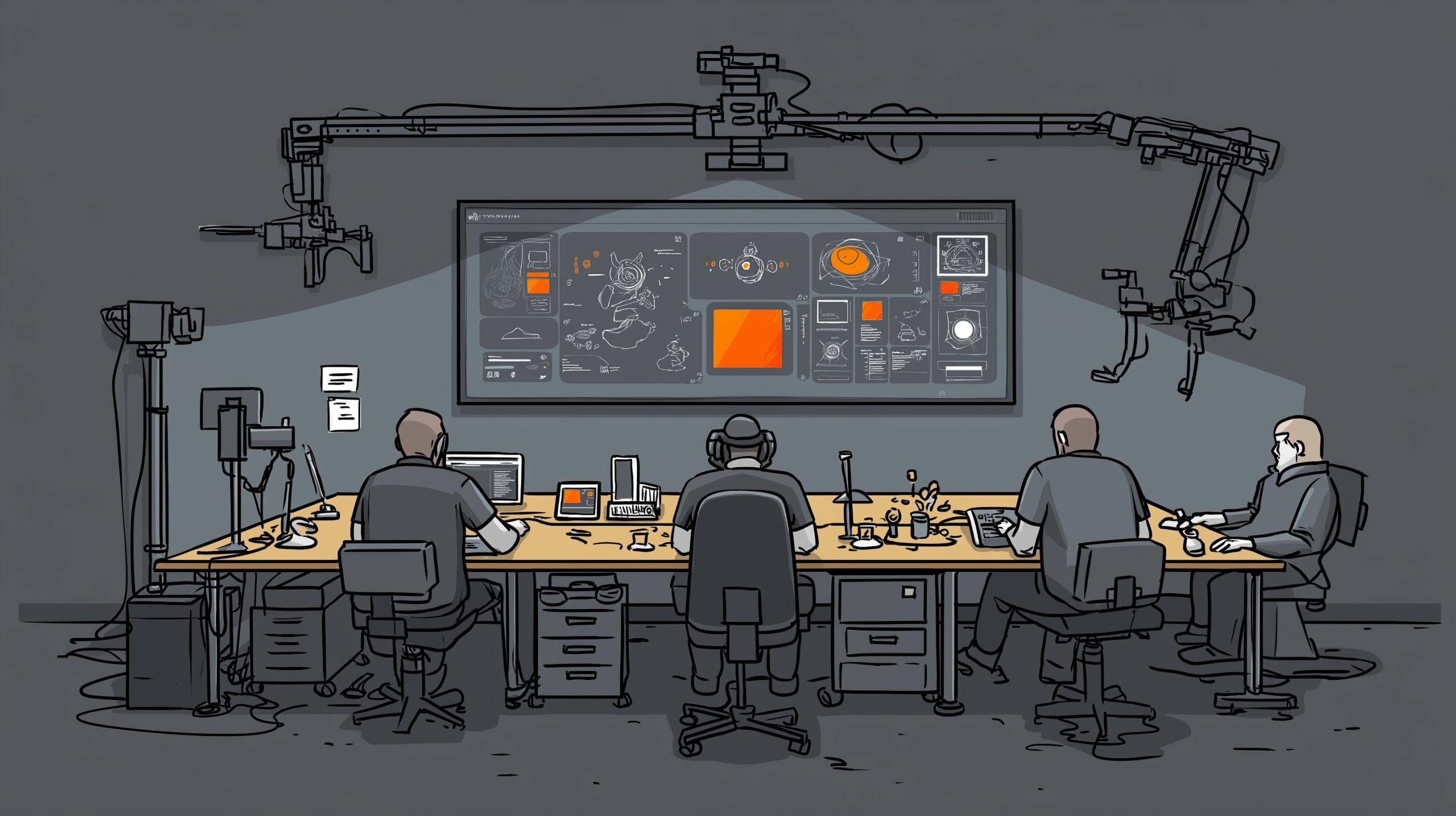
As we enter the latter half of 2025, enterprise UX is evolving to reflect technological advancements as well as cultural, operational, and ethical changes. If 2024 was about laying the groundwork for more adaptive, inclusive, and intelligent experiences, the back half of 2025 is proving to be a time of refinement and realignment. Here are…

Design Contests and Competitions
Running a low-budget design contest without asking for some degree of speculative (no-spec) work can be tricky. Organizers must balance the need for creative input with ethical considerations, ensuring that participants feel valued rather than exploited. While contests can be an effective way to source fresh ideas, they can also discourage professional designers if structured…

Sonia Kozlova Clark: Bridging Art and Audience Through Visionary Management
It was this act of moving hearts and minds utilizing the raw material of art, but it takes a deft hand to untangle the artist’s involvement with those who appreciate their art most. As Sonia Kozlova Clark exemplifies, the managing of art can be art. Her brilliance is evident in her exhibitions at the Lewiston Artpark. Whether it…

The Evolution of Enterprise UX Design in 2024
As we enter 2024, we can see that enterprise UX has changed completely. Driven by technical growth, evolving workplace culture and an increased focus on efficiency and inclusion, enterprise UX has adopted newer paradigms that lay a foundation for a future that exemplifies more connected and user-centric design. Here’s a look back at the key trends, milestones,…
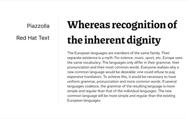
Google Fonts Pairing in 2024
Choosing the right font pairing can significantly impact the overall look and feel of your website or a web application. Google Fonts offers a vast library of free and open-source fonts, making it a popular choice for designers and developers. In this blog post, we’ll explore some fresh Google Font pairings for 2024 that cater…
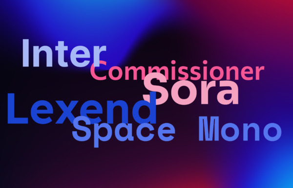
Best Google Fonts for UX Design 2024
As web design continues to evolve, staying current with typography trends is essential for creating engaging and effective websites. Google Fonts offers a continually updated library of fresh and innovative typefaces that can enhance the aesthetic and functionality of your digital presence. Here’s a look at some of the best new Google Fonts for 2024,…

Enhancing User Experience in B2B Enterprise Web Applications: UX Best Practices
User experience (UX) is pivotal in the realm of enterprise web applications. As the digital landscape evolves, businesses find that a well-executed UX design can dramatically boost productivity, reduce user errors, and increase overall satisfaction. This is particularly true in B2B environments where streamlined and effective web applications are crucial for daily operations. A thoughtful…

Embracing the Future: New UI Design Trends for SaaS Products
In the ever-evolving landscape of software as a service (SaaS), staying ahead of design trends isn’t just about aesthetics—it’s about providing users with an intuitive, efficient, and engaging experience. Let’s dive into the latest trends shaping the UI design of SaaS products, ensuring your tool looks fresh and aligns perfectly with user expectations and needs….

B2B UX in the Age of AI and Automation: Personalized User Journeys
The advent of AI and automation marks a pivotal shift in the B2B landscape, ushering in a new era of digital transformation that touches every facet of business operations, from sales and marketing to customer service and beyond. This transformative wave brings with it a bounty of opportunities for innovation and growth but also necessitates…

Rossul Recognized as a Clutch Global Leader for 2023
Toronto, Canada, Today — Rossul, a preeminent UX and UI design firm dedicated to enhancing end users’ journeys through meticulously crafted, functional applications, is thrilled to announce its achievement as a 2023 Global Award laureate for UX Design services for enterprise applications by Clutch, the principal global marketplace for B2B service providers. This honour reflects…