Embedded UI for Scientific Data Analysis
On-device user interface for a spectrophotometer.
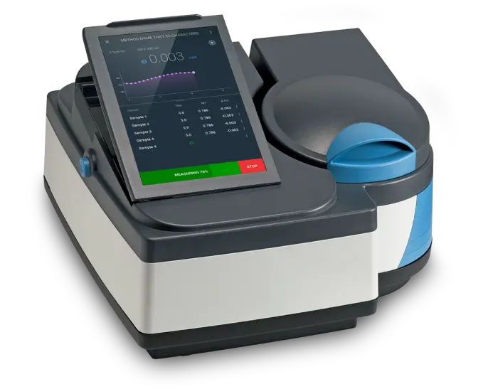
Overview
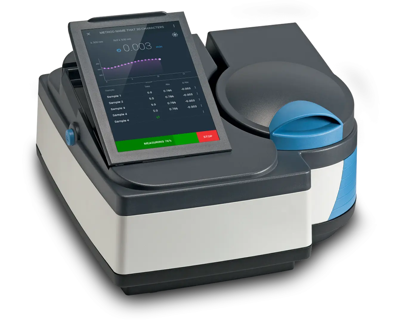
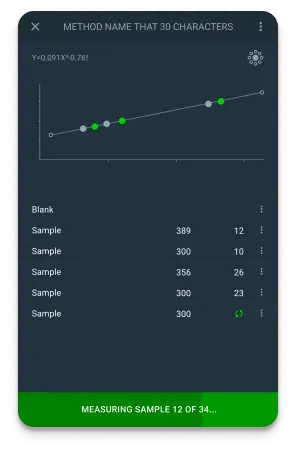
On a laboratory instrument, the on-device interface is part of the product: it defines how fast technicians work and how much they trust the readings. We partnered with Thermo Fisher Scientific to redesign the embedded software for a laboratory-grade spectrophotometer, working within the hard constraints of on-device hardware: a small screen, fixed resources, and workflows that must match lab protocol exactly. Technicians complete procedures faster, novices need less supervision, and navigation-related support tickets dropped after deployment.
The Challenge
The instrument’s previous interface was analogue, relying on physical buttons and a basic digital display. This created a significant barrier to efficiency, as complex procedures required cumbersome, multi-step inputs. The challenge was to manage the critical transition from a physical, tactile control system to a modern, touchscreen-based software interface. The new digital experience had to be more powerful and efficient, yet intuitive enough for a user base accustomed to physical controls—all while working within the realities of a constrained hardware environment.
The Solution
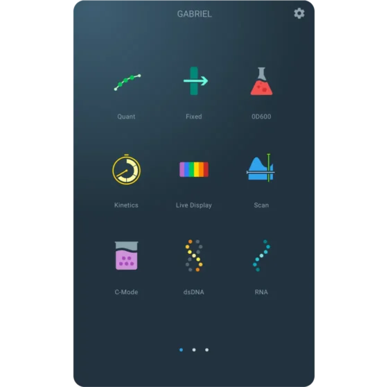
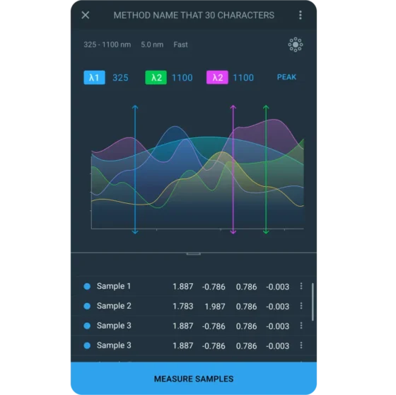
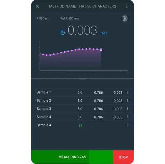
Our solution was grounded in a deep understanding of the end-users and the technical environment. We conducted interviews with lab technicians, researchers, and product stakeholders to identify task friction, workflow inconsistencies, and critical gaps in the existing interface. This research directly informed a complete, user-centered redesign of the on-device software.

The Results
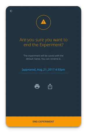
The solution successfully transformed the scientific workflow. By optimizing the design for the constrained embedded screen, the application ensures lab professionals operate the instrument more efficiently, directly reducing errors and improving overall productivity.
Unlock Your Hardware's Full Potential. Request a Consultation
Let’s discuss how we can help you design a custom embedded software solution that improves user efficiency and increases the value of your products.