Blog

November 29, 2009
Prescient Digital Media
I’ve had the pleasure of working with Rossul on a number of high-profile web projects for our clients. He is highly knowledgeable and understands the fundamentals of good design and how to apply them for outstanding results. He continually meets or exceeds my expectations. Hiring Rossul for your next project is a sure bet for...
November 25, 2009
Mobile Traffic at glance (by AdMob)
A few days back, AdMob published a very interesting report on market share of various mobile OS and smartphones. The data suggests that Apple's dedication to user experience results in higher app approval and user adoption rates. The report is a great read but for those that don't have time here are the highlights: Smartphone...
November 11, 2009
Remembrance Day
Remembrance Day Are they dead that yet speak louder than we can speak, and a more universal language? Are they dead that yet act? Are they dead that yet move upon society and inspire the people with nobler motives and more heroic patriotism? ~Henry Ward Beecher One of my grandfathers was killed in the first...
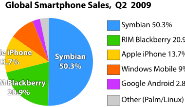
Smartphone sales per OS vendor
Stats from June 09 shows Symbian being the clear leader in the Mobile OS market, thanks to Nokia and a few Sony Ericsson and Samsung devices. (data does not include Palm WebOS, which was introduced in June, 2009) Market share of Smartphone operating systems as of Q2/2009 by Canalys. It will be interesting to see...
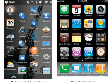
Windows Mobile 6.5 UI issues and Windows Mobile 7
ZDNet reports that Windows Mobile 7 is on track for release to OEMs for testing. It is interesting to see what MS can come up with in the new highly competitive market. Android, Sumsung's just announced Bada, iPhone OS, Symbian^2 - the first open version of Symbian's OS. Windows 6.5 was not up-to-speed with the...
November 10, 2009
Usability over Aesthetics
I really admire good design, a tasteful colour palette and the fine finish of all UI elements. But Google pays no attention to any of it. Their design is completely data driven and they are known for things like testing 64 shades of blue for few months before deciding on the colour of the box...

TweetBoard Alpha
TweetBoard makes Twitter available right on your website. The window is dynamic and doesn't get in the way. It seems to be a very cool and usable way to facilitate your marketing efforts and may even communicate with your customers. We are awaiting alpha testing approval and will let you know about the integration process...
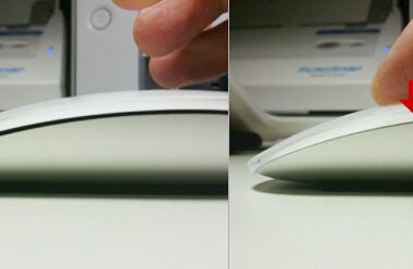
Apple's MagicMouse - Most usable mouse ever
MagicMouse is a very well-designed device. I got it on the first day they were available and spent about 10 days using it. The mouse is great. Very responsive and precise. Still runs on the original batteries with about 40% charge left which means it will go for about about 3 weeks. The gestures work...
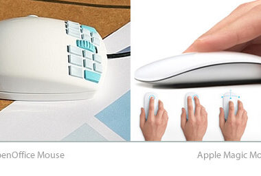
OpenOffice Mouse - 7 buttons for each finger
After debut of Apple's Magic Mouse - a super well and smartly designed piece of hardware, OpenOffice Mouse produces mixed feeling. The bulky and very impressive design that places 7 buttons under each finger might require extensive training to use. (Piano players will have a definite advantage using it). The thumb button makes it look...
November 9, 2009
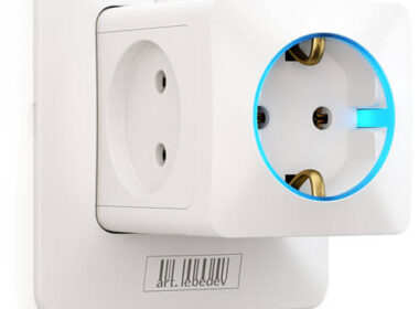
Design In Use - Rozetkus 3D
Here is a good example of what design should do for us; make our everyday life a bit easier. Art Lebedev - a Russian design studio that came up with the Optimus Keyboard, (1257.14€) a few years ago is back with a useful concept that does solve a real problem in hand. Rozetkus 3D looks...
Let's Work Together
Working with ROSSUL is more than a transaction – it is a long-term partnership!