Embedded UI for Scientific Data Analysis

On-device user interface for a spectrophotometer.
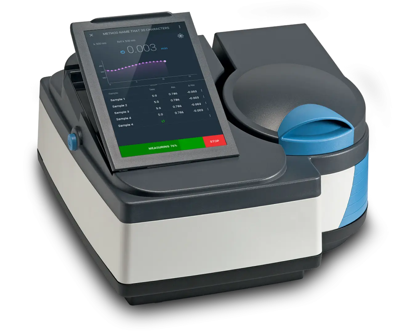
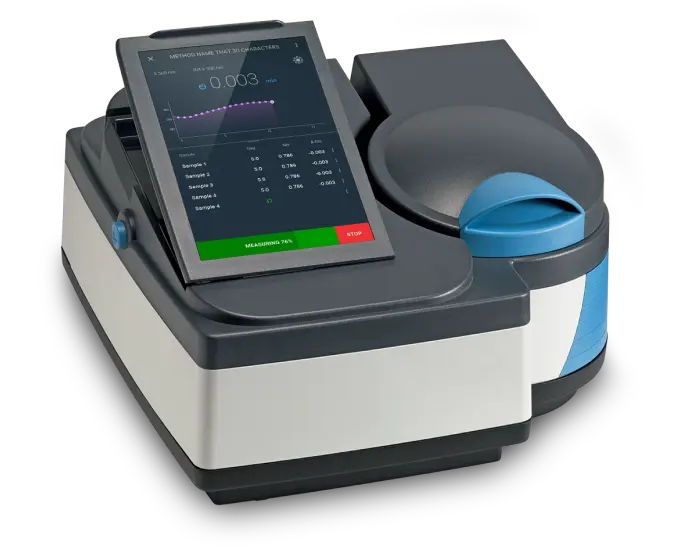
Benchtop spectrophotometer with a tilted touchscreen showing an absorbance reading, a plotted curve, a sample table, and a measuring progress bar with a stop control

Overview

On a laboratory instrument, the on-device interface is part of the product: it defines how fast technicians work and how much they trust the readings. We partnered with Thermo Fisher Scientific to redesign the embedded software for a laboratory-grade spectrophotometer, working within the hard constraints of on-device hardware: a small screen, fixed resources, and workflows that must match lab protocol exactly. Technicians complete procedures faster, novices need less supervision, and navigation-related support tickets dropped after deployment.

The Challenge

The instrument’s previous interface was analogue, relying on physical buttons and a basic digital display. This created a significant barrier to efficiency, as complex procedures required cumbersome, multi-step inputs. The challenge was to manage the critical transition from a physical, tactile control system to a modern, touchscreen-based software interface. The new digital experience had to be more powerful and efficient, yet intuitive enough for a user base accustomed to physical controls—all while working within the realities of a constrained hardware environment.

The Solution

Our solution was grounded in a deep understanding of the end-users and the technical environment. We conducted interviews with lab technicians, researchers, and product stakeholders to identify task friction, workflow inconsistencies, and critical gaps in the existing interface. This research directly informed a complete, user-centered redesign of the on-device software.
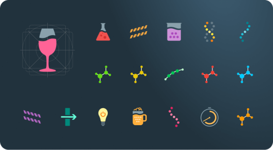
Set of colored application icons for measurement modes on a dark background, including a cuvette, a flask, molecules, and a spectrum bar

Purpose-Built Iconography for Lab Environments

To provide at-a-glance clarity, we created a tailored icon library optimized for the specific actions of a lab environment. Each icon was designed from the ground up to be visually distinct, high-contrast, and easy to interpret, eliminating ambiguity between similar functions. This custom approach reduces cognitive load, allowing technicians to focus on the procedure at hand and minimizing the potential for costly errors.

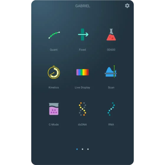
Instrument touchscreen home menu with tiles for Quant, Fixed, OD600, Kinetics, Live Display, Scan, C-Mode, dsDNA, and RNA

Streamlined On-Device Navigation

We restructured the application’s navigation from a feature-based model to support more efficient, task-oriented flows that mirror a technician’s real-world process. By prioritizing common lab procedures, the new design enables users to move logically and quickly between setup, calibration, and testing steps. This flatter architecture eliminates the frustration and potential for error associated with unnecessary taps and deeply nested menus, directly contributing to faster, more reliable sample processing.

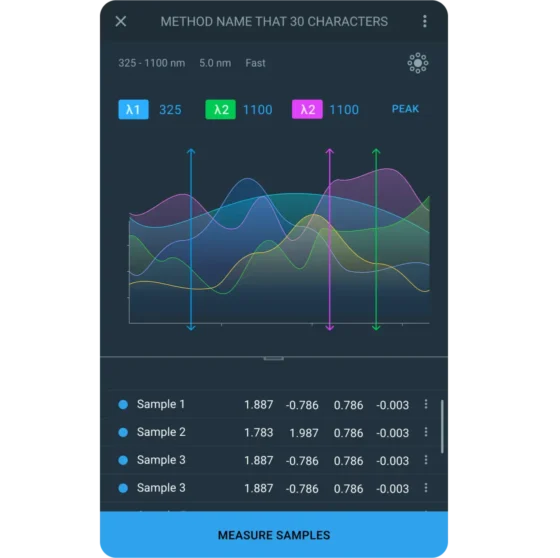
Instrument screen showing wavelength settings, overlaid spectral curves with wavelength markers, a sample results table, and a Measure Samples button

Maximizing Data Visibility on a Constrained Display

In a lab environment, clear data presentation is non-negotiable, as misinterpretation can compromise an entire experiment. The new interface presents results with a distinct visual hierarchy, giving immediate prominence to critical measurements while maintaining easy, secondary access to raw data and reference markers. This prevents cognitive overload by showing technicians exactly what they need to see first. All visualizations were carefully enhanced with a color palette, scale, and typographic structure specifically chosen to maximize legibility and clarity on the compact, embedded display.

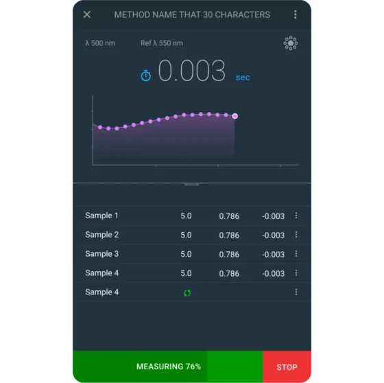
Instrument screen showing a kinetics reading with a plotted curve, a sample results table, and a measuring progress bar with a stop control

Guiding Complex Lab Workflows

To reduce ambiguity and prevent procedural drift, we introduced contextual UI states to guide users through each phase of a workflow. As a user progresses, the interface dynamically highlights the current step and disables irrelevant controls, such as changing sample parameters after a test has begun. This approach actively prevents mistakes and creates a clear, focused path for the technician. This in-app guidance ensures that lab protocols are followed correctly, improving procedural consistency, ensuring data integrity, and reducing the risk of human error.

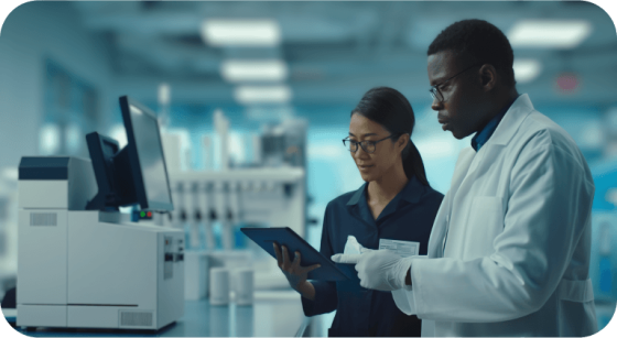
Two lab workers in a laboratory looking at a tablet beside an instrument

Validation and Close Collaboration

Throughout the project, we partnered closely with Thermo Fisher’s internal teams to test early, interactive prototypes, a crucial step for identifying usability issues before development. Our usability testing sessions included both new lab technicians and seasoned researchers, providing a comprehensive view of the user experience. This dual-audience testing allowed us to validate specific efficiency improvements and ensure the final design was both easy to learn for novices and powerful enough for experts.

The Results

The solution successfully transformed the scientific workflow. By optimizing the design for the constrained embedded screen, the application ensures lab professionals operate the instrument more efficiently, directly reducing errors and improving overall productivity.
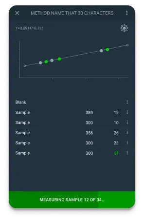
Instrument screen with a standard curve plot, a list of blank and sample readings, and a progress bar showing which sample is being measured
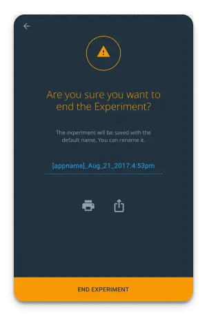
Confirmation screen asking whether to end the experiment, with an editable save name, print and share icons, and an End Experiment button
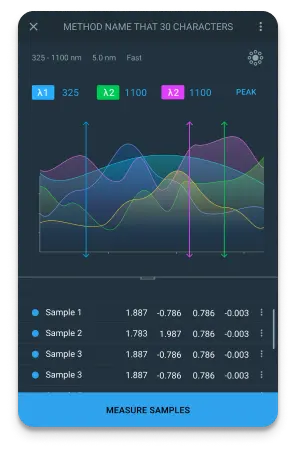
Instrument screen showing wavelength settings, overlaid spectral curves with wavelength markers, a sample results table, and a Measure Samples button
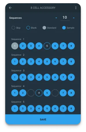
Cell accessory setup screen with a sequences count, sample type options, and rows of numbered cell positions above a Save button
Benchtop spectrophotometer with a tilted touchscreen showing an absorbance reading, a plotted curve, a sample table, and a measuring progress bar with a stop control

Accelerated Procedural Workflow

Task completion became faster and more consistent, even among less experienced users, thanks to clearer navigation, improved affordances, and reduced screen complexity.

Future-Proof Extensibility

The new interface introduced a consistent visual language, iconography, and set of interaction standards across the device, enabling faster onboarding and ensuring future firmware updates would be easier to implement.

Enforced Scientific Protocol

The clear, in-app guidance was designed to match standard lab protocol steps, reducing the risk of human error and improving adherence to institutional standards.

Data Clarity & Confidence

A clear and hierarchical presentation of results, including contextual markers and trend indicators, enabled faster data interpretation and supported better-informed decision-making in the lab.

Seamless Hardware Integration

The final design and implementation were verified across all hardware variants, touchscreen calibrations, and display densities, ensuring complete fidelity and functionality in real-world use.

Minimized Support Dependency

After deployment, internal product owners and support staff noted fewer support tickets related to navigation and confusion around the instrument's usage. Designing within hardware constraints is a specialty of ours. Start at UX/UI design services.

Unlock Your Hardware's Full Potential. Request a Consultation

Let’s discuss how we can help you design a custom embedded software solution that improves user efficiency and increases the value of your products.

    Your privacy is important to us. We will only use your information to respond to your inquiry. We will never sell or share your data with anyone.

    Schedule a Meeting