Weather Canada App

UI/UX Design for Real-Time, Accessible, and Accurate Weather Data

Overview

As a leading UI/UX design agency, we partnered with a Canadian government agency to re-architect a legacy weather application used by millions of citizens. This enterprise-level project required full WCAG 2.1 AA compliance, bilingual UX design, and a scalable design system for responsive access across desktop and mobile platforms. Our objective was to create a streamlined, accessible experience that could deliver life-critical weather alerts quickly and clearly.

Challenges

The legacy app was dense, outdated, and difficult to use under urgent conditions. Alerts were buried in cluttered layouts, visual icons were unclear, and the interface lacked proper accessibility and multilingual support. We needed to re-architect the application to:

  • Re-architect the system from the ground up to support modern public-sector digital infrastructure
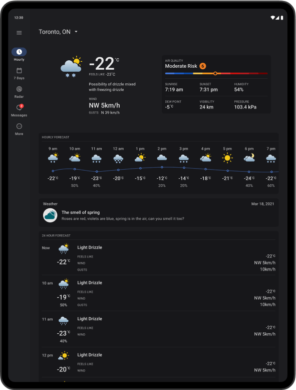
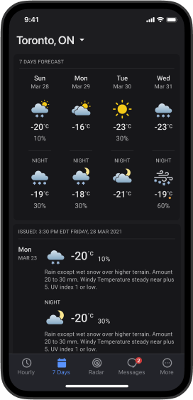
  • Create a new information hierarchy tailored to how users seek weather data
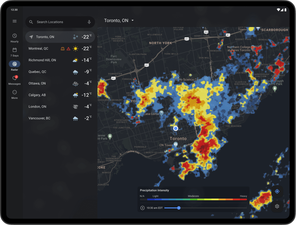
  • Design a new navigation structure that simplifies movement between forecasts, alerts, and radar views
  • Develop a scalable interface framework usable across desktop, mobile, and tablet
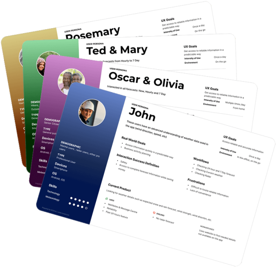
  • Support the needs of both expert users (e.g., professionals) and casual public users
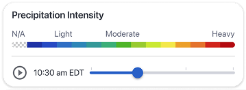
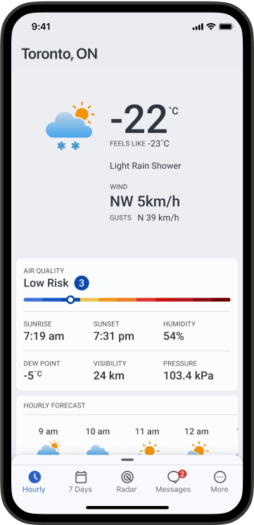
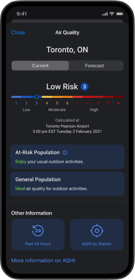
  • Improve visibility of critical alerts and time-sensitive content
  • Ensure full accessibility and bilingual usability from the core outward
  • Reimagine alerting framework to prioritize severe weather notifications
  • Consolidate fragmented content into detailed, user-friendly modules
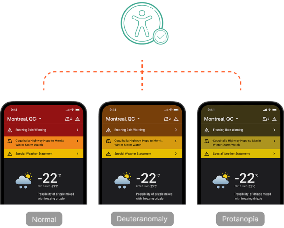
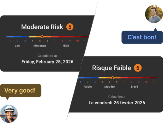
  • Seamless bilingual UX (EN/FR) with parity in tone, structure, and function
  • Full WCAG 2.1 AA accessibility compliance with screen reader and keyboard support
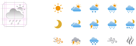
  • Custom icon system optimized for clarity, consistency, and cross-demographic comprehension

Our Approach

We started with stakeholder workshops and contextual inquiry, interviewing both internal teams and public-facing user segments. Accessibility specialists and bilingual testers were included from the beginning.

User Research & Persona Development

We conducted detailed research to identify key user personas, including professional users such as meteorologists, sailors, and construction workers, alongside casual users. This helped us tailor the design for users who relied on technical weather data and radar accuracy, while ensuring ease of use for general users looking for simple weather updates.

Young Canadians and the General Public

Designed an interface that is visually appealing and intuitive, allowing users to quickly access weather updates.

Senior Citizens

Enhanced readability with large fonts, high contrast, and simplified navigation to provide a user-friendly experience.

Pro Users (Marine, Construction, and Others)

Focused on designing an advanced weather radar feature that provides real-time, accurate weather data tailored for professionals who rely on precise weather conditions for critical decision-making.

Custom Icon Design

We designed a comprehensive icon system from scratch to ensure visual clarity across all weather conditions and user demographics. Each icon was crafted to be immediately recognizable, semantically meaningful, and legible at a variety of screen sizes and resolutions—including mobile and tablet displays. The system was rigorously tested for contrast compliance and usability by both general users and professionals in critical weather contexts.

Information Architecture Overhaul

We restructured the entire information architecture and navigation model around core user questions—”What’s happening now?” and “How should I prepare?”—to reflect the urgency and utility users expect from a public weather service. This shift away from legacy, topic-based groupings helped users more quickly locate critical alerts, contextual radar data, and actionable guidance across various screen sizes and devices.

Accessibility Compliance

We conducted thorough accessibility testing across the entire interface to ensure full WCAG 2.1 AA compliance. This included verifying minimum color contrast ratios for visual elements, enabling complete keyboard navigation for users who cannot rely on a mouse, tagging all interactive components for screen reader compatibility, and reducing motion sensitivity to accommodate users with vestibular disorders. Each component was validated against real-world use cases by accessibility specialists and representative end users.

Validation & Bilingual UX Testing

We conducted one-on-one interviews and usability testing in both English and French, gathering feedback from professional users as well as everyday Canadians. This allowed us to validate the design across both official languages, ensuring a consistent and intuitive user experience for everyone.

Scalable, Future-Proof Design

The new design system is modular and responsive, built to adapt seamlessly across mobile, tablet, and desktop environments. It maintains a high level of usability and visual clarity regardless of screen size, while preserving access to detailed weather data and location-based content. The scalable framework also ensures future extensibility as new features or alert types are added.

Results

The redesigned Weather Canada app delivered significant improvements in both usability and performance, meeting the diverse needs of its user base.

Enhanced User Experience

We redesigned the interface with clearer layouts, simplified navigation, and reorganized content to align with user priorities, making it easier to find and understand key information.

Bilingual Usability

The interface supports seamless switching between English and French, with carefully crafted content parity to provide a consistent experience across both official languages.

Scalable Design

The design system was intentionally modular and extensible, allowing for the seamless integration of new features, alert types, and technology updates over time. This future-focused flexibility ensured the app could continue evolving without requiring a redesign—supporting long-term sustainability for both the user experience and the underlying infrastructure.

Increased Engagement

The revamped design led to more users interacting with radar views, forecast layers, and real-time alerts, demonstrating improved feature discoverability and usage.

Improved Accessibility

Through rigorous WCAG 2.1 AA compliance efforts—including screen reader tagging, high-contrast color schemes, and keyboard navigation—the app became accessible to a wider range of users.

Faster Access to Critical Information

Users can now instantly recognize and respond to severe weather scenarios thanks to a redesigned alerting system, improved iconography, and contextual prioritization of urgent content.

Let’s work together

We work with government teams and public-facing organizations to design inclusive, accessible digital platforms.

    Your privacy is important to us. We will only use your information to respond to your inquiry. We will never sell or share your data with anyone.

    Schedule a Meeting